Table of Contents
Label Design Trends: Simple, Bold, and Built for In-House Production
The strongest label design trends share one principle: every element earns its place — and brands that print in-house can test and act on trends faster than those relying on outsourced production.
Key Takeaways
- Simple, high-contrast design reduces visual noise and improves shelf recognition by giving every label element a clear purpose.
- Color systems help multi-SKU product families stay cohesive while allowing each variant to feel distinct — a particularly effective strategy for brands with multiple flavors, strengths, or formats.
- Story-driven labels rooted in a brand’s actual origin, process, or values are harder for competitors to replicate than generic polished design.
- Specialty finishes and custom shapes add meaningful shelf impact when they align with the product — the goal is purposefulness, not novelty.
- Eco-conscious packaging language must be accurate, specific, and verifiable; vague sustainability claims without substantiation can undermine brand trust and attract FTC scrutiny.
- In-house digital label printing removes minimum order quantities and plate costs, letting brands test and iterate on design trends without committing to bulk pre-printed inventory.
Why Label Design Trends Matter
Label design trends are practical signals — they reflect what shoppers respond to, what shelf environments reward, and where brand differentiation is moving.
Labeling trends move quickly, but the strongest ideas tend to be practical: make the product easier to understand, make the brand easier to remember, and make the package feel intentional. A good label is not only decoration. It helps shoppers recognize the product, navigate the category, and decide whether it belongs in their cart.
The trends covered here represent directions that are gaining traction across consumer goods categories — food and beverage, health and beauty, household products, and specialty retail. Each one has real implications for how brands design, produce, and update their labels. Understanding which trends are relevant to a specific brand is the first step; having the production flexibility to act on them quickly is what separates brands that follow trends from those that lead them.
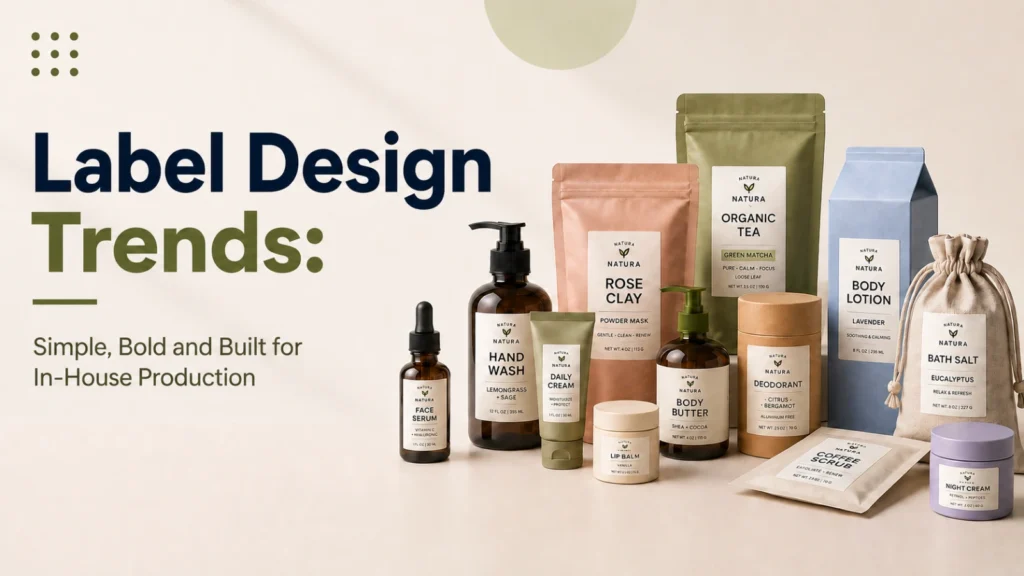
Simple, Bold Label Design
Simple labels stand out because they reduce visual noise and make the most important information — brand name, product type, key claim — easy to find at a glance.
Clear visual hierarchy, strong typography, and restrained design choices guide the eye to the right information before a shopper reads a single word. This is not about making every label look minimal — it is about ensuring every element has a job. Typography communicates tone, color creates recognition, spacing prevents clutter, and layout supports the scan pattern of someone browsing a shelf.
Brands that treat simplicity as a design discipline — rather than a lack of effort — consistently produce packaging that looks more considered than competitors who try to fill every available inch. Textures, metallic treatments, and font choices can all coexist within a simple design system, as long as each element reinforces rather than competes with the overall message.
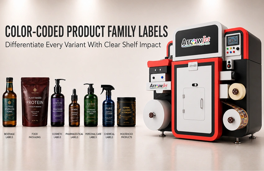
Color as a Product Signal
Color is often the first thing a shopper registers — even before reading a brand name — making it one of the most efficient tools in label design.
Brands can use color to separate product variations, build shelf recognition, and communicate a product’s mood or positioning before a customer engages with the details. A warm amber on a whiskey label, a clean white on a clinical skincare line, or a vibrant gradient across an energy drink range — each choice is doing functional communication work before the label is read.
A color system is especially useful for product families with multiple SKUs. It allows each variant to feel distinct while still looking like it belongs to the same brand. Shoppers learn to identify the flavor, strength, or format they want based on color alone, which reduces decision friction at the shelf.
Using the brand’s existing identity — logo, typeface, core brand color — as an anchor and building variant colors outward from that foundation is a reliable approach. It keeps the range cohesive without requiring every product to look identical.
Labels That Tell a Brand Story
Every brand has a history, a point of view, or a reason for existing — and label design can translate that story into visual choices shoppers remember.
Story-driven labels express identity through the detail of every design decision: the illustration style, the choice of material texture, the typeface, the color palette, the layout structure. When those choices are specific to the brand’s actual origin, ingredients, process, or values, the result is packaging that competitors cannot easily copy with a template.
Generic polished design can look professional, but it rarely builds a connection. A label rooted in something true — a family recipe, a production region, an unusual ingredient source — invites the shopper into a context that extends beyond the product on the shelf. That context can be a significant differentiator, particularly in categories where product formulations are otherwise similar.
Brands that revisit their story when refreshing label design — rather than simply following current trends — tend to produce packaging with more longevity. A trend-chasing label often needs to be updated again in two to three years; a story-grounded label is more durable.
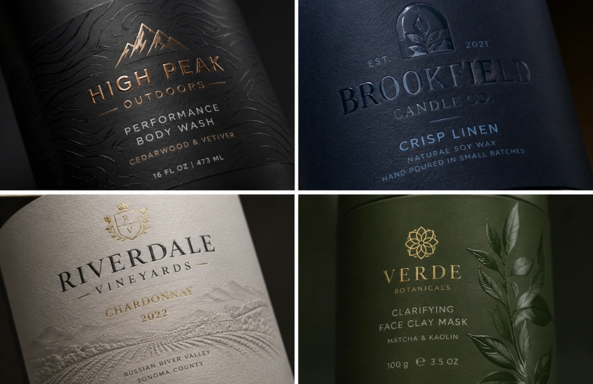
Specialty Shapes and Finishes
Custom die cuts, tactile coatings, metallic effects, and textured materials can make packaging significantly more memorable — when used with purpose rather than as novelty.
Custom label shapes break the rectangular grid that defines most shelf space. A contoured label on a bottle, a shaped label that mirrors the product outline, or a die-cut window that reveals part of the product beneath — each creates a physical interaction with the shopper that a standard shape does not. These details attract attention and can signal quality or craft before any information is read.
Tactile finishes — soft-touch matte coatings, embossed textures, spot gloss over a matte background — add a physical dimension to the packaging experience. They hold attention for longer and often communicate a premium positioning that color and typography alone cannot deliver.
The principle that applies to all specialty treatment is purposefulness. A label stacking multiple premium finishes without a clear reason can look busy rather than considered. Every specialty element should feel like it was designed for this specific product, not selected from a catalogue of available effects.
Vintage and Handmade Influences
Vintage-inspired label design remains popular across multiple categories because it signals craft, heritage, and familiarity — when handled with enough originality to avoid imitation.
The appeal of vintage aesthetics comes from what they suggest: that a product was made thoughtfully, by people who cared, in a tradition that predates mass manufacturing. Aged typography, hand-lettered elements, engraving-style illustration, and warm color palettes all draw on those associations.
The risk is imitation without distinction. A label that copies the surface markers of a vintage category leader reinforces a competitor’s positioning rather than creating its own. The most effective vintage-influenced designs layer a contemporary detail — a clean grid, a modern type pairing, a high-contrast version of an antique palette — over a traditional foundation. This keeps the label from looking like an historical reproduction while still borrowing the warmth and familiarity of the older reference.
Brands with genuine heritage or a craft production story are in the strongest position to use vintage influences authentically. For newer brands, the same aesthetic can work when it is grounded in something real — an ingredient source, a regional connection, a production process — rather than applied purely as a styling choice.
Eco-Conscious Packaging
Shoppers increasingly factor packaging materials and environmental responsibility into purchase decisions — making accurate sustainability labeling both a market signal and a compliance consideration.
Brands are moving away from single-use plastics, exploring recyclable face stocks and liners, reducing label size, and shifting to water-based inks where compatible. These are real and measurable production changes, and they give brands something specific to communicate on the label rather than relying on vague environmental positioning.
The compliance dimension matters here. The FTC Green Guides set standards for environmental marketing claims in the United States, and regulators have increased enforcement attention on packaging claims that are broad, unqualified, or potentially misleading. Terms like “eco-friendly,” “sustainable,” or “green” without substantiation are precisely the language the Guides advise against.
Specific, accurate claims build trust over the long term. “Made with 30% post-consumer recycled content” is a claim a shopper can evaluate. “Recyclable where facilities exist” is honest about the limitation. These are the kinds of statements that hold up over time — and support rather than undermine the brand’s credibility when examined.
Recyclable label
A label made from a material that can enter a recycling stream — typically paper, certain BOPP films, or PET — and whose adhesive does not contaminate the recyclability of the container it is applied to. Recyclability depends on both the label material and local facility capability.
PSR-compliant label (Pressure-Sensitive Recyclability)
A designation indicating that a pressure-sensitive label meets recyclability standards established by TLMI (Tag and Label Manufacturers Institute). PSR compliance covers both the face stock and the adhesive’s performance in a recycling stream.
Water-based inkjet ink
An ink system using water as the primary carrier rather than solvent. Water-based pigment inks — used in ArrowJet aqueous digital label presses — produce lower VOC emissions than solvent-based alternatives and are compatible with a wide range of label stocks including paper and film substrates.
Printing In-House: The Operational Advantage
Design trends are easier to execute when the label production workflow can keep up — and in-house digital label printing removes the delays, minimums, and plate costs that slow outsourced production.
Brands that rely on external label suppliers have to commit to design decisions weeks in advance, order quantities well above what they need for a seasonal test, and wait for new plates when artwork changes. Every one of those constraints pushes against the agility that trend-responsive label production requires.
In-house digital label printing changes that equation. Updated artwork can print on the same day the file changes. Short runs are just as cost-effective as longer ones. Seasonal packaging, limited-edition color variants, and label updates driven by regulatory or formula changes can all be produced without minimum order commitments or multi-week lead times.
Two ArrowJet label presses are well-positioned for brands building in-house label production:
ArrowJet Aqua 330R
An industrial digital label press built for consistent, high-quality output across a wide range of pressure-sensitive label stocks — coated paper, BOPP, PET, and film substrates. The Aqua 330R suits brands that need reliable, production-grade output and the flexibility to run multiple SKUs and label variants without plate setup costs between jobs. See the ArrowJet Aqua 330R.
ArrowJet Eco 330R
A compact industrial single-pass digital press for brands moving beyond desktop printers without taking on the complexity or overhead of a larger press. The Eco 330R runs on single-phase power, requires no air compressor, and fits real shops with space constraints — an accessible entry point for smaller brands and growing in-house operations. See the ArrowJet Eco 330R.
Interested in in-house label printing? Arrow Systems manufactures digital label presses for brands at every scale of production. Request a sample print to discuss your label production requirements.
Outsourced vs. In-House Label Printing: Key Differences
Factor | Outsourced Label Printing | In-House Digital Label Printing |
Artwork revision turnaround | New plates required; 2–4 weeks per revision | File update; print same day |
Minimum order quantity | Typically 1,000–5,000+ labels per SKU | No minimum — print exactly what is needed |
Setup cost per design change | Plate and setup fees per color, per job | None |
Seasonal or variant label testing | High-risk — large MOQ to test a single variant | Low-risk — short runs test viability before scaling |
Obsolete inventory risk | High — design or regulatory changes strand pre-printed stock | None — print only what is needed, when it is needed |
Multi-SKU color system execution | Complex — each variant requires a separate plate run | Straightforward — variants run as separate digital files on the same press |
Frequently Asked Questions — Label Design Trends
Simple design, clear color systems, and story-driven packaging are practical starting points because they improve shelf recognition without requiring unnecessary production complexity. For small brands, the ability to print short runs in-house — rather than ordering large pre-printed quantities — is what makes testing these trends financially viable. The ArrowJet Eco 330R is built specifically for this use case, handling the scale of a growing in-house operation without the overhead of a larger press.
They can be, especially when the shape reinforces the product’s identity and helps it stand out on a crowded shelf. The added cost or production complexity should be weighed against brand impact. Die-cutting and laser finishing equipment can produce custom label shapes from digitally printed rolls, which allows brands to test specialty contours without committing to large minimum orders.
Use only accurate, specific, and verifiable language. The FTC Green Guides caution against broad, unqualified terms like “eco-friendly” or “sustainable” without substantiation. Claims should describe what is actually true — the material, its recyclability status, or the specific production practice — in plain terms customers can understand. Clear, responsible claims build trust over the long term; broad, unsubstantiated claims risk doing the opposite.
Outsourced printing typically requires minimum order quantities, plate setup costs, and lead times of two to four weeks per revision. In-house digital label printing eliminates plate costs and minimum quantities, allowing artwork changes to print the same day the file is updated. For brands testing new color variants, seasonal packaging, or updated sustainability claims, the speed and flexibility of in-house production removes the risk of committing to inventory before a design direction is validated.
A color system assigns distinct, consistent hues to product variants while maintaining shared brand elements — logo placement, typography, background tone — across the entire family. Shoppers learn to associate a color with a specific variant, which speeds recognition and reduces confusion at the shelf. Digitally printed labels support color system execution because individual variants can be produced in any quantity without per-color plate charges.
Brewery Labeling: How Craft Breweries Print Labels In-House to Cut Costs
Table of Contents Brewery Labeling: How Craft Breweries Print Labels In-House to Cut Costs In-house brewery labeling lets craft operations print exact run quantities on
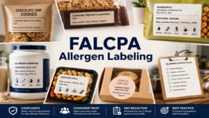
FALCPA Allergen Labeling: What Food Brands Must Print to Stay FDA Compliant
Table of Contents FALCPA Allergen Labeling: What Food Brands Must Print to Stay FDA Compliant FALCPA allergen labeling requires US food brands to declare nine
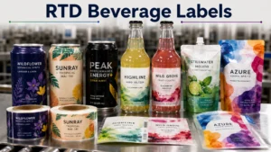
RTD Beverage Labels: How to Print for Cans, Bottles, and Flexible Pouches
Table of Contents RTD Beverage Labels: How to Print for Cans, Bottles, and Flexible Pouches RTD beverage labels vary by container format — pressure-sensitive for
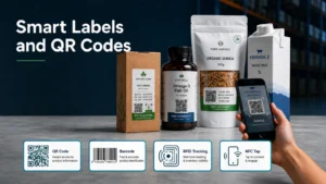
Smart Labels and QR Codes: How They Work on Product Packaging
Table of Contents Smart Labels and QR Codes: How They Work on Product Packaging Smart labels use QR codes or barcodes to connect physical packaging
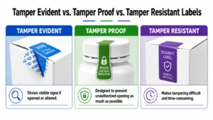
Tamper Evident vs. Tamper Proof vs. Tamper Resistant Labels: Key Differences
Table of Contents Tamper Evident vs. Tamper Proof vs. Tamper Resistant Labels: Key Differences Tamper evident shows proof of access. Tamper resistant deters removal. Tamper
Child-Resistant Cannabis Packaging: A Printing Compliance Guide
Table of Contents Child-Resistant Cannabis Packaging: A Printing Compliance Guide CR cannabis packaging is certified under CPSC 16 CFR §1700.20 — and certification attaches to