AAFCO Pet Food Label Requirements: 2026 Brand Guide
Table of Contents AAFCO Pet Food Label Requirements: 2026 Brand Guide AAFCO pet food label requirements define eight mandatory elements every dog and cat food
Choosing the right font for your label and brand is an important decision that can have a significant impact on the perceived value and credibility of your product or service. The font you choose can convey a sense of sophistication, elegance, or even playfulness, depending on the context in which it is used. In this blog post, we’ll explore some of the key factors to consider when selecting a font for your label and brand, and provide some guidance on how to make the right choice.
The first thing to consider when selecting a font for your label and brand is the overall aesthetic of your product or service. If your product is sleek and modern, for example, you may want to choose a font that is also sleek and modern, such as Futura or Avenir. On the other hand, if your product or service is more traditional or classic, you may want to choose a font that is more timeless, such as Garamond or Caslon.
Another important factor to consider when selecting a font for your label and brand is legibility. The font you choose should be easy to read, even at small sizes, so that customers can quickly and easily read the name of your product or service. This is particularly important for labels and packaging, where space is often limited. Some font types like Serif, Sans-serif and Display font are more legible then others. Serif font, for example, tends to be more legible than sans-serif font when printed at small sizes because the serifs act as “anchors” that help the eye distinguish between letters.
The next factor to consider when selecting a font for your label and brand is the overall tone or feeling that you want to convey. Some fonts can convey a sense of formality and elegance, while others can convey a sense of playfulness or fun. For example, a font like Baskerville may be well-suited for a luxury brand, while a font like Comic Sans may be more appropriate for a children’s toy brand.
The weight of the font is also an important factor to consider when selecting a font for your label and brand. The weight of a font refers to the thickness of the letters, with heavier weights being more bold and attention-grabbing, and lighter weights being more subtle and understated. The weight of the font you choose should be appropriate for the context in which it will be used.
Once you’ve narrowed down your font choices based on these factors, it’s a good idea to do some testing to see how the font looks in various contexts. Try the font out in different sizes, colors, and layouts to see how it looks on different backgrounds and in different lighting conditions. This can help you get a better sense of how the font will look when it is used in the real world, and can help you make an informed decision about which font is the best fit for your label and brand.
In conclusion, selecting the right font for your label and brand is an important decision that can have a significant impact on the perceived value and credibility of your product or service. The key factors to consider when selecting a font are the overall aesthetic, legibility, tone or feeling that you want to convey and the weight of the font. It is essential to test the font in different contexts before making your final decision. By considering these factors and doing some testing, you can make an informed decision about which font is the best fit for your label and brand, and help your product or service stand out from the competition.

Table of Contents AAFCO Pet Food Label Requirements: 2026 Brand Guide AAFCO pet food label requirements define eight mandatory elements every dog and cat food

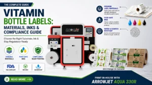
Table of Contents Vitamin Bottle Labels: Materials, Inks, and Compliance Guide HDPE supplement bottles require substrate, adhesive, ink, and workflow decisions that are compliance decisions